The Symbol
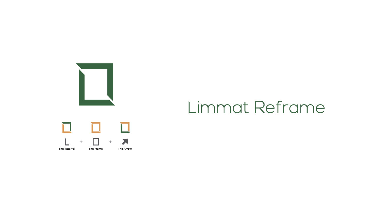
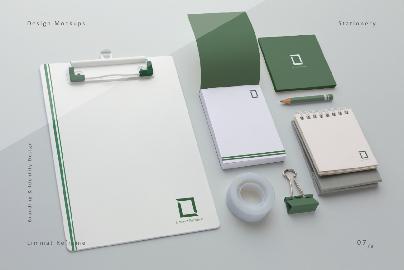
The symbol represents the core idea of helping the organizations and individuals alike by reframing challenging situations through human centered designs. The overall symbol visually carries out the process of reframing. The lower left part of the symbol represents the first letter of the company name i.e. ‘L’ and the upper right part stands for an ‘arrow’ which is pointing upwards to convey the idea of continuous growth and prosperity.
The Wordmark
The wordmark is an essential signifier of the brand as the first letter of the company name i.e. ‘L’ is being slightly modified around its edges to bear certain similarities with the symbol. The uniqueness of the wordmark conveys a sense of individuality which makes it flexible and can be used separately without the given symbol.
Typography
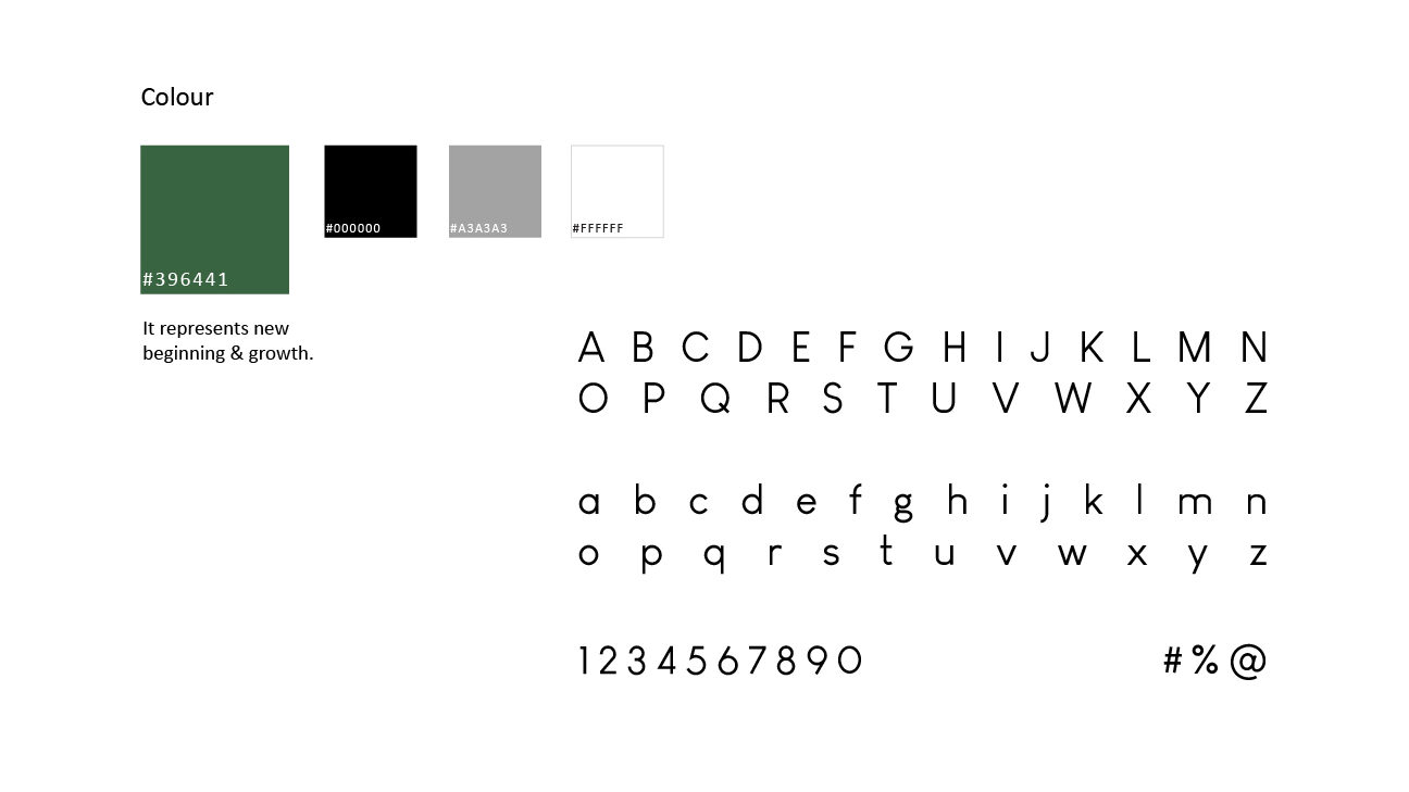
Primarily the font ‘Louis George Café’ is used to make the wordmark. This particular sans serif font family bears a slick and geometric characteristic of its own which complements the geometric symbol of the brand creating a perfect harmony in the overall design. Apart from the visual similarities, this font brings a certain sense of sophistication and elegance to the identity of the brand.
Client Feedback_
I had the pleasure of working with Arup, who designed the logo for Limmat Reframe. The professionalism with which he conducted this work earned him my trust and respect, especially for the following three reasons:
He took the time to establish a clear understanding of the context and target group within which the branding would need to communicate, he combined this understanding with his superior knowledge of the different contexts in which the CI might be used and this allowed him to build a visual vocabulary that has been serving me extremely well ever since.
During the development of the brand he showed immaculate reliability and delivered timely results in quick iterations based on which we could discuss options, requirements and functionality. I remain grateful for Arup’s excellent work, hold him in the highest regard for his ability to combine conscientiousness and attention to detail with quick turnaround times and a communication style that allowed him to challenge my dysfunctional beliefs about design work. I did not only receive a design that excels in delivering my messages, bit was also gifted an improved understanding of the requirements one needs to take into account for such endeavors.
– Sebastian Rappen, founder of ‘Limmat Reframe’.
Work Type – Freelance ( 2020 )
Company Name – Limmat Reframe ( Service Provider )
Design Category – Brand & Identity Design
Art Direction – Arup Mondal
Graphic Design – Arup Mondal